Just a quick one today (it’s bad enough that it’s actually no longer Monday) – something that I remember that my Year 9 art teacher, Mr Foley, taught me, oh, back in 1984…
break the line.
It’s as simple as knowing that (when drawing) a plain, straight, consistent weight line can be boring.
Of course, sometimes a solid, even line is the look you’re going for.
But if you want a more realistic image that ‘dances’, it’s good to make your illustration more calligraphic, by pressing harder and softer with your pen or pencil, and leaving gaps in the line – this means the viewer subconsciously fills in the gaps, and becomes more ‘involved’ with your picture.
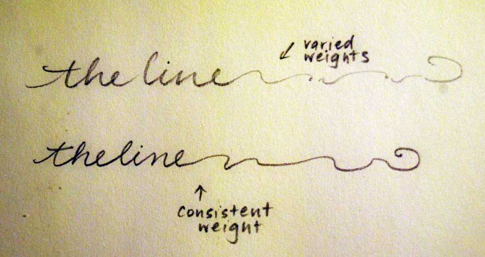
(notice the ebb and flow of the lines now?)
I thought I’d draw you an example – so here is a quick sketch of our old tricycle in all it’s wonky back wheeled glory.
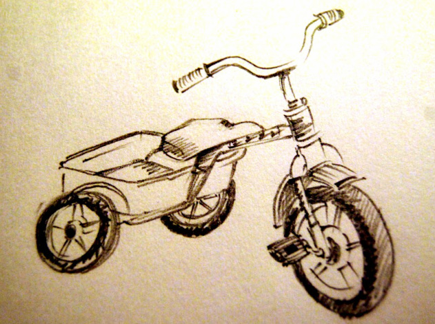
And then I was going to draw it with a single weight line as a comparison. But one of my children rode it away while I was distracted by the phone… and I can tell you where all the children are now, but I can’t tell you precisely where the tricycle is …
So here is a chair instead (much harder to be ridden away).
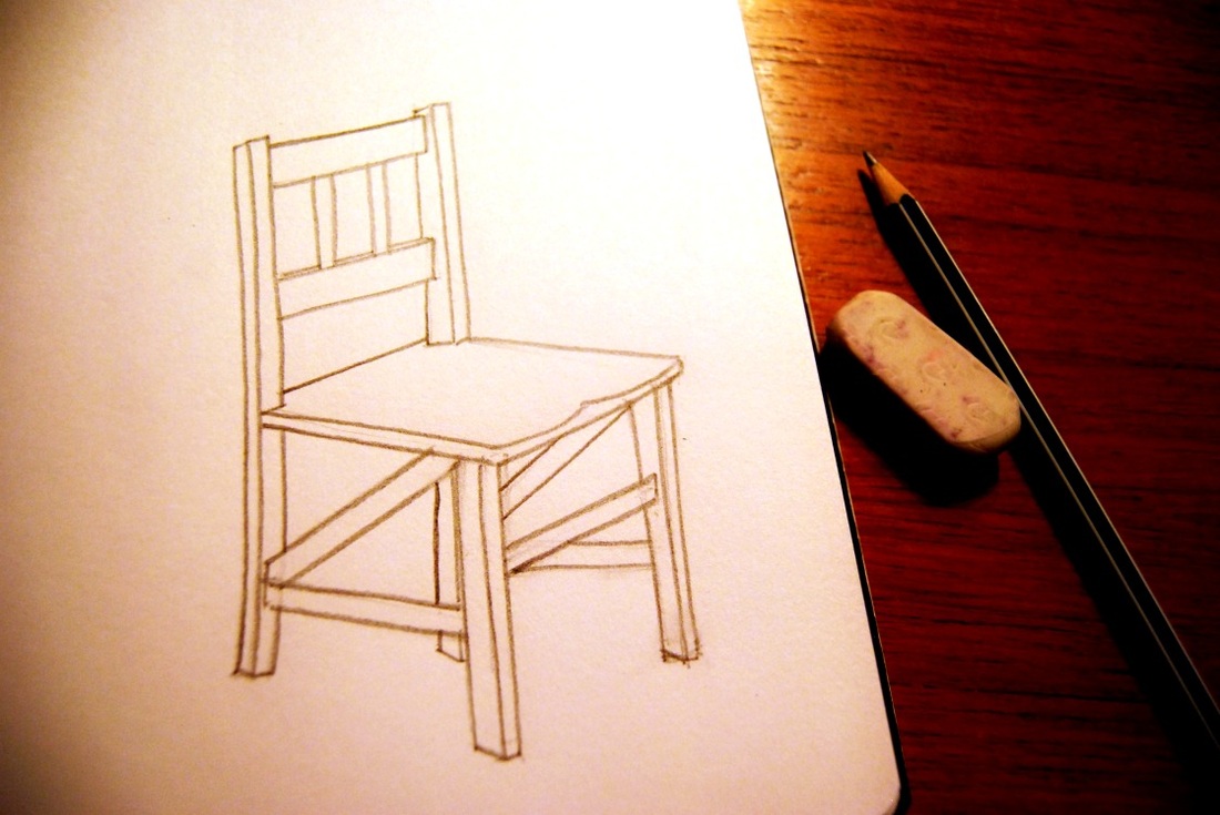
And it’s late now, so I’m not going to redraw the chair at the moment with a stop-start line. (I might do that another day this week and add it in here.)
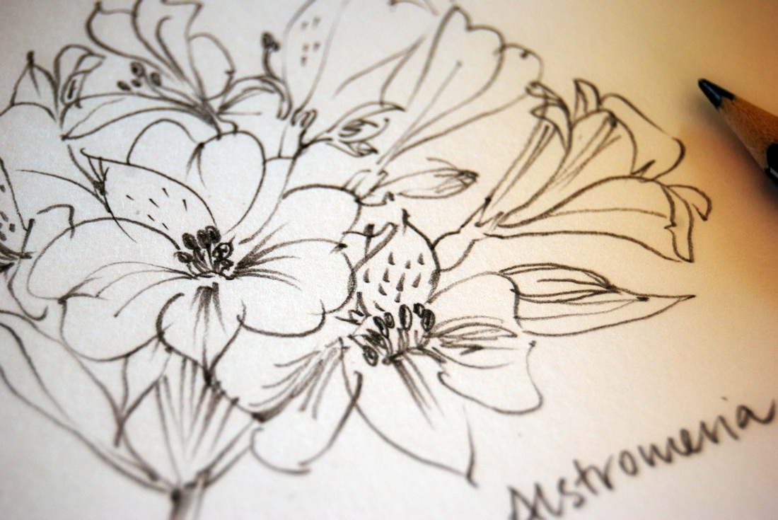
But can you see that the chair is quite bland in comparison to the trike and the flowers? And by giving yourself permission to let the line ‘dance’, you are very likely to make your whole image ‘sing’ too.
Go on, try it.
It is harder to colour images in photoshop or similar, if you have breaks in the lines so ‘dropped in colour’ escapes. But there are ways to handle that too, which I’ll cover in a future post.
You can use this method with painted lines too – and I’ll talk about “losing and finding” edges in an Art Tip to come.
Happy line dancing!
(This blog post was originally posted in October 2010.)


